Sunday 31 January 2016

Milan Erasers Singapore Review

  You've probably noticed that Art Friend has brought in quite a number of products from a company called Milan.

  Milan is the leading brand on erasers. And my god do they have a wide selection of erasers... And if you're anything like me, you're probably staring at the whole range of their erasers and being stressed out over which erasers is the best for you.

  The good news is that I've finally gotten around to getting all the erasers that Art Friend sells and now you have the pleasure of seeing them all in one post. ^-^

I sorted them by numerical number. From lowest number, to highest number.
Design 320, Office 320, Gigante 403, Artist 520, White Technik 630, 740, 840, Tecnik, Oval 1012, 1220 (kneaded eraser), 1420 (the Master Gum), 4024, extra soft 5020, Graphic 6024, Nata® Negra,  and the Design 9320.
  The paper I'm using is from an old Monologue sketchbook that I had. I also bought it from Art Friend.

  The pencil that I'm using is the Derwent Onyx pencil in the shade "dark", which isn't really fair to the erasers because most of them are meant for pencils harder than 2B only... But I think it's a good experiment.

  How I've gone about testing the erasers is seeing how much graphite each eraser picks up on one swipe, and then how much of the graphite I can erase with as many swipes as I need. I also show how much dust each eraser created before showing the page after it's dusted off.  I realised after a while that each Milan eraser really is made for a specific use, as the name of the erasers somewhat implies.  So do note that this is not a test to see which eraser is "the best of the best". I was only curious as to how each eraser would fare against graphite which is what I want an eraser for.

  (The information about each eraser is taken from the Milan site, but I added some personal opinions too.)

  Are you ready? Cause here we go~


  •   320 Design is made from PVC plastic. It erases pencil strokes from all kinds of surfaces. This eraser felt much harder than the rest, which, I think, isn't a bad thing at all.
  •   I don't really think the casing of the Office 320 is a great idea because as you use up the eraser, you'd have to pull it out from its casing. Then when you're erasing, it might get annoying when you accidentally push the eraser back into the casing...
  •   The Gigante 403 is, like its name tells you, really gigantic. I guess a big eraser for big mistakes? Or perhaps for throwing at people who make gigantic mistakes in your presence. hahaha. The eraser itself is a little dusty. And if you're wondering how much the big guy weighs... the answer is 150grams. I weighed it.
Singapore 50 cents for scale; and how it looks like in my tiny hands.

  A thing to note here is that I mainly use erasers to erase light underdrawings, which is why I don't like it when my erasers are too dusty. If you're a graphite artist, though, a dustier eraser would be better because it wouldn't disturb the paper too much.


  •   740 is at a very big disadvantage in this review. It's a rubber ink eraser– like rubber, but with silica grit in it. There was dust! DUST EVERYWHERE! To be fair, though, I shouldn't even be using it on graphite...
  •   840 is a "combination eraser". A high-breed, of sorts. hahaha. For some reason, though, it's not listed on the Milan website. The pink end of it is made of natural rubber, which was soft and quite nice to use. The blue end of it is for ink, which, after my bad experience with the 740 eraser, I did not try to use on graphite. I tried it against Derwent's Line Maker and it did a less-than-stellar job with erasing the ink. The ink-erasing award goes to 740, but I really enjoyed the feel of the natural rubber of this eraser.
  •   The kneaded eraser comes in a little plastic wrapper.. But I tried to knead it and it didn't seem pliable at all.


I broke off a little bit of the eraser and as you can see, it looks dry and didn't fold on itself well at all. :/


  • The Master Gum is dusty, but does its job really well. Apparently, it's a special and improved eraser, made of a synthetic rubber that has a high capacity for the adsorption of charcoal and graphite. It erases easily without exerting pressure on the surface of the paper, forming soft crumbs. It also can also be used to erase or blur strokes of charcoal drawings.
  •   Not pictured is the 2424- reason being is that it has been the eraser I've kept in my art pouch and use regularly (until I made this review and found a different eraser I liked better). 2424 has its number printed on the top and middle of the eraser, which I thought was nice. Both the 2424 and the 4024 are made of soft synthetic. They erase most graphite on all surfaces.
  • The extra soft 5020 is a plastic eraser and it really is soft and squishy.
  • I found out that "Negra" is Portugese for Black. It is a black PVC eraser; is extra soft with great absorption power. Suitable for soft pencil strokes and does not damage the paper. I really like Milan's Nata® line, though.
  • 9320 Design is a thermoplastic eraser (sounds fancy). Non-abrasive; able to erase deep strokes made by hard pencils.


  The erasers that did their job the best are the Artist 520, Tecnik 920, and the Master Gum. So I decided to do a comparison between those three on one page:

And my favourite ended up being the Tecnik 920 because it created the least amount of dust.
It has actually become the eraser that I've kept in my art pouch.

I didn't particularly care for the 740 because we're in the 21st century and you might as well use a correction tape. I also wonder why Milan stopped making natural rubber erasers...

  And before you go, I have one more eraser that I wanted to show you... The Milan Cleaning Cushion. It is a very peculiar, and rather large object. A sort of bag filled with eraser dust (imagine putting an eraser into a blender) and its purpose is to gently removes dirt and smudges without abrading the surface.

It is, quite easily, the weirdest art product that I currently own.
It's really soft and squishy. I imagine it'd make lightening large sketches very easy, but rather messy. In any case, I really like it for its novelty. hehehe

  To see a very helpful pdf guide on all Milan erasers, click this link. It is picture heavy, though... So if you're not on wifi, it might take a while to load. And really, all the info you need is in this post. ;)

  I hope you enjoyed this review. Let me know in the comment section below which Milan eraser you like the best, or whether you prefer an eraser from a different brand.

Thursday 28 January 2016

we're verve-ing into February soon

   Another week has zoomed by so quickly. I've been so busy with classes for the past week. It has been gloriously fun. I learnt to use Luv-a as a border from a student of mine; I'm back to reviewing art materials and have a review about Milan erasers to be posted this week; I'm filming more tutorials and speed-drawing videos; and as always, I'm creating wonderful art pieces, too. Have a look at what I've done for the week...

If you'd like to see a video of me drawing the background of this postcard, you can view the video via this link.

I did a tile with "Onion Drops", paired with "Printemps" as a filler.

I had taught a class how to draw "Arukas" so that they could place Zengems in the middle of the circles. A student then asked how she could use "Arukas" with other tangles. I did this tile to show her. Featuring "Bornaro" and "African Artist" as well.

  Now onto some challenge submissions for this week. Starting with Joey's Challenge. We had to use String String 121 and pair it with the tangle "Pais".

My submission for Diva's Challenge. I used the shape of "Singapore Sling" and added "Cadent" in it with a cute little "Luv-a" border. "Singapore Sling" is my tangleation of "Auraknot". You can see the step-outs for it by clicking this link.

My mum's tile for Diva's Challenge. "Mooka" with "Verve" inside it, and some "Tipple" details.

I'm so close to finishing my tangle-a-day calendar for the month.
Get a printable template of the February 2016 Calendar for free by clicking this link.
If you'd like the January 2016 one, you can have it too by clicking here. I hope you like them~

Lastly, a commission piece that I did.
The client said that the border looked a little too empty. Solution? Draw "Diva Dance" on the frame and matting board, of course. ^-^

  Thank you for looking. Leave a comment letting me know what your favourite tangle pattern is. I want new ideas for my February calendar page.

Friday 22 January 2016

the start of something new

  As always, I've been creating lots in the past week.   ^-^

My version of Mooka. You can view my step-outs to it via this link.
Initially, I wanted to add Tipple or SharlaRella to the background, but I settled on keeping it really simple.

Abundies, Fleavy, Printemps, SharlaRella, and Mooka
Moving on to something more complex.
Abundies, Fleavy, Printemps, SharlaRella, and Mooka (at the top left corner).

I used lots of SharlaRella this week, didn't I?
Paired with Zengems and my very own tangle, Singapore Sling. You can see step-outs to Singapore Sling via this link.

  Unfortunately, I didn't take part in many challenges because none of them really spoke to me. I did, however, participate in Adele's "It's a String Thing #128". Here's my submission for the challenge:
We used String #129, with Paradox and Hypnotic.
I decided to do a monotangle. I love the string, though, and I had so many ideas that I wanted to try... Definitely going to use the string again soon.

I have trypophobia- the fear of holes, and this tile triggered it a little... I had to set it aside once or twice when I would overthink things.... I'm happy with how it turned out, though.
More Zengems! Paired it with Flux and Crescent Moon.

With this one, I was trying out Chainging. Did the gem in the centre, and then thought a simple background would look better.

  Here's the something new that I mentioned in the title of this post:

  I'm starting a tangle-a-day project. I know that Carole Ohl sells her own tangle-a-day calendar, but I was looking for something smaller... Just a small square for each day that I could complete within ten minutes as a warm up. I created this calendar that is printable in A4 format and I'm sharing the template with all of you for your own personal use. I also give permission to all CZTs to share this with their students in class. Please do not sell the template, or upload it elsewhere. You can download the calendar page from this link. I hope you have fun with it, and enjoy using it as much as I have had so far. I'll also be uploading February's calendar a few days before the month starts. So look out for that in a future post. :)

  Class things:
Kristen, a student of mine, brought in her daughter, Bella, for a class. I had to think of a way to introduce the Zentangle method to Bella whilst still teaching Kristen new patterns. I think the class went superbly well because Bella has decided to join future classes. Woohoo!

Here's a white tile that I messed up and painted over with black acrylic.
I love the tile now. And it's not a mistake if no one sees it, right? The Zentangle idea of "No mistakes; only opportunities." is very very true here. hehehe

Finally, an original tile with another pretty gem on it.
I like how the yellow and green leaves look neon in colour.

  That's about all I have for this week. I hope I've inspired you to try something new. Don't forget to try the tangle-a-day calendar. I love all the comments all of you leave, and I'm thankful for each and every one of them. Until next week, keep tangling~

Saturday 16 January 2016

Monsters of the Sea at the Singapore Science Centre

  A few days ago, I visited the Singapore Science Centre with a friend. We went to see the "Monsters of the Sea" exhibition. There's not much info on the Science Centre's website about what to expect from the exhibition.. However, I did see a commercial for the event on tele one time and they showed life sized replicas of the creatures, so I was excited.

  My friend and I took the train to Jurong East, and the Science Centre was just a short walk away. You can even have brunch at the near-by malls first, just like we did. ^-^

  At the entrance of the Science Centre, you're greeted by a small sea monster. It's electronic and moves and lets out growls every now and then, which was really fun. A small glimpse of what we would be able to see in the event area.


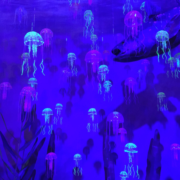
  We bought tickets, which cost us $20 each, and then were ushered in. The event space itself is indoors, fully air-conditioned, and is held in a dark room illuminated by neon coloured lights. The lights really added to the atmosphere.

Science Centre, Monsters of the Sea,
We got to see many sea creatures, all true-to-life size (they were huge!) and lots of them could move, too!

Science Centre, Monsters of the Sea,

Science Centre, Monsters of the Sea,
I love jellyfish. Is the plural of "fish", fish or fishes..?
Can you spot the sea monster lurking in the background?

Science Centre, Monsters of the Sea,
This one was gigantic, and really creepy.
I should've taken a photo standing beside it to show you how big it really was.

  There were lots of mini activities scattered around the event space, too. Things like embossing plates that you could use to create a pretty picture with using the paper and oil pastels provided... Documentaries on show... Puzzles shaped like the sea creatures that you could try to solve in under three minutes... Even a high striker to test your strength!
Science Centre, Monsters of the Sea,
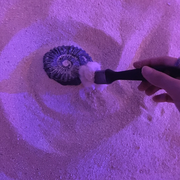
They also had a sandbox where you could find your very own fossils!
(But of course, you couldn't bring them home. hehehe)

Science Centre, Monsters of the Sea,
Submarine beside the area that we watched a short documentary about Megalodons.

  There were many other sea creatures at the event, and many other small surprises that I'm not showing because I want you to experience the magic for yourself. The event will be on from now through to the 28th of February 2016, so head down to the Singapore Science Centre soon~

I had lots of fun at the event. I hope you had fun looking at all the cool pictures of the sea monsters, too. Till' next time~

Wednesday 13 January 2016

too many choices equals to not doing anything

  I really did try to think of tangles/strings to use for this week's Diva Challenge... But I just felt so overwhelmed by choices. Does that happen to you, too? I'm like a kid at a candy store... If I can do anything... Then there's so much to do! Gosh. Where do I start?? So, unfortunately, I don't have a submission for the challenge. If I do get around to doing it, I'll be posting it in another post.

  My mother, however, did complete the challenge. Here's Joni's tile for this week's Diva Challenge: Back to Basics...
I love the way "Hollibaugh" grows out from "SeZ".
  I did complete my tile for Joey's challenge, though. This week featured Knightsbridge. Here's Joni's tile:

  And here's mine:


  Onwards to other tiles that I did.
Molygon with a gemstone.

Molygon again. Giving credit to Lynn Shelton Mead. She did a tile with this shading idea and I loved it so much I had to try it out for myself. I'll definitely be doing different patterns with this method in the future.
This week, I taught my students how to create this beautiful flower thing with Flux.
All of them loved it.

A tile I did for a promotional video for my Zentangle classes. You can watch the video below.

A tile featuring a new tangle I learnt: "Mumsy", with some soapstone and charcoal highlights.
I don't like how the black tile literally drink all of the ink up, and I'm probably going to be layering my tiles with black acrylic paint from now on to make them more enjoyable to work on...

This was a white tile that I painted black with acrylic paint. Look how much brighter the whites are.
I shouldn't have used "Pebble Flowers" on the inside of the circle... But we move on.
Here's a commission I'm currently working on.
Nine jewels to represent abundance. Four birds to represent the number of members in their family.

Mooka! Want to know how I drew this version of it? Link to step-outs is right here.
I'm still trying to figure out whether I should add "Roxi" or "Tipple" in it... Or use "SharlaRella" instead. What do you think?

Lastly, a pretty Zendala that I did.
There's "Reticulated", "Yuma", "SeZ", "Betweed", "Inapod", "Crescent Moon", and a Zengem.

  I hope you're having a good week so far. Stay inspired, and keep tangling! ^-^