Showing posts with label coloured pencil. Show all posts

Tuesday, 22 August 2017

My Entry to UOB Painting of the Year Competition

  I joined the UOB Painting of the Year Competition this year. It's my first time entering it, and I decided to do a piece that showed tangles. My main idea was to have a girl surrounded by pastel colours and tangles. I knew that the pieces that would be submitted for the competition would be considerably large, so I decided to make my piece in a larger format. I found a frame that I thought was a good size then cut a large sheet of Fabriano paper to fit the frame. The art work ended up being 50cm by 70cm (19.6" by 27.5").

This was my sketch:
I inked the girl and the plants so that the camera would be able to capture what I drew. You can also see the light markings I did for the background segments.

    Then I added Winsor and Newton watercolours on the background. I stuck to blues, pinks, and purples.

  Making progress on the tangles...

  Tangles completed! Now onto shading! I used Tombow's dual brush markers.

  I also added details using a white Uni-ball Signo Broad pen, and the gold finish was added with Finetec paints.

  Moving onto the girl and the flowers, I used Derwent's Coloursoft coloured pencils, sticking to the colour scheme of pink, blue, purple.

  And finally, after three full days of working on this piece, I was done. I really do prefer the quicker gratification I receive when I work on a regular Zentangle® tile.

  Here are some detail shots:


  The results will be out this week. I'm excited. We'll see how it goes. Prize or not, I'm extremely proud of this art piece, and it's shown me how far I've come artistically in the past two years and what I can achieve.

Tuesday, 22 December 2015

the river flows in you

  Woohoo! Part two of what I've done in the past week.

  Aside: The title of this post is related to a drawing I'll be showing later. And it's also the title to this really beautiful song... (link right here.) You might want to click on the link to listen to the song while you're reading this post. ^-^

  Jewels; jems; gems... Whatever you want to call them...

What happened with this jewel was that I accidentally cracked it... But I decided to just roll with it and enhance the cracks with ink.
"How did you crack it, Stephanie? Isn't the jewel drawn onto paper..?"
Yes, but I used a special method to make the jewel extra special. I'll be posting a mini tutorial soon.

  The next drawing is pretty cool (if I do say so myself). It was inspired by the Willamette River Historical Stream Channels in Oregon.
In 1941, the Mississippi River Commission appointed Harold Fisk to undertake a groundbreaking effort to map the entire Lower Mississippi Valley. Three years later he produced a stunning series of 15 maps that combine over 20 different river paths obtained through historical charts and aerial photography.

You can see the original picture (made 
by cartographer Dan Coe) that inspired the drawing via this direct link: (click me)

Playing around with Cadent and Bunzo. Bundent..? Eh.
And a little Leaflet border at the side.

Have I posted this drawing before? I can't remember.
I think it looks pretty, though. So here it is (again?).
Coloursoft on my tiga sketchbook.

Lastly, a hella rad inked drawing.
I like the sci-fi, oriental look it has going.
  And that's about it for this week. Thanks for looking~

Tuesday, 1 December 2015

mucking about with Mooka

  I received my tiga sketchbook that I backed on Kickstarter, and I've been using it for the past week. Here are some of the works I've done in it so far.

Hollibaugh Zentangle
Hollibaugh within Hollibaugh,

Arukas is amongst those few tangles that I really struggle with.
I'm determined to get better at it, though.

I also played around with Mooka.
I didn't actually like the fact that it doesn't close. So I thought of ways to make it work for me.

Update: I've made a tutorial on how I draw my version of Mooka. Link is right here: (click me)

grained zentangle tree
A coloured page for Diva's Challenge. Tangle used: "Grained".
I haven't decided what tangles to add to the tree..... I'll update this post once I get around to it.
(Shoutout to Dilip. It was great seeing you at CZT21.)


cruffle zentangle,
"Cruffle" and a variety of things I thought of doing with it...
As a border, as a tangle, and as "ornaments".

I've recently been obsessed with Heartswell.
It's just such a simple yet elegant tangle...

Done with Coloursoft.
I wanted to see how coloured pencils would lay on the sketchbook.

  Joni has been busy with a new project for Everything Is Art, so she doesn't have tiles to show for this week... Here's a sneak peak at what she has done so far, though:

  Thanks for looking and for leaving such wonderful comments last week.

Monday, 6 October 2014

"Princess of the Sun" Process gif

"Princess of the Sun" by Stephanie Jennifer

  I thought this would be a fun gif to make. A process gif of how I made "Princess of the Sun". I'll be making two more drawings with similar compositions but in different colour schemes. The next one I'm working on will be of a phoenix. :)

  Hope you're having a wonderful Monday so far~

Monday, 19 May 2014

Recommended Artist: Jennifer Healy


  A little loving for one of my fellow coloured pencil artist; Jennifer Healy. Her works are absolutely gorgeous and full of details that really steal your breath away. 

  You can view more of her works via her Deviantart.

Monday, 3 March 2014

Prismacolors In Singapore (v.2)

  Remember that one post I made about Art Mark and how you could find Prismacolors there? Well, yeah... I don't stand by Art Mark's customer service anymore, due to various reasons. So, as a public service, here's a post on alternative places to get your Prismacolors.

  As a side note; I've been to Art Mark thrice. The first two times was to make purchases. They stock Bristol boards and Prismacolors, so I was there to shop. The third time was to take pictures for the Prismacolor post. I had noticed that the shop's staff were not as attentive as I wanted them to be, and on another occasion, another staff kept following me all around the shop, staring intently at what I was doing (I presume it was because he was afraid I'd steal something). I thought it was just me over-thinking things, but I've received two comments from people as of today, that stated that they had had bad experiences at Art Mark as well.

  Thus, I decided to make this post.

  The only other shop in Singapore that I know of that sells Prismacolors, is Straits Art Co. It's a shop run by two brothers, whom are extremely nice people and are very generous with their knowledge in art products. They sell boxed sets of Prismacolors and a limited variety of open-stocked Prismacolors.
Location: North Bridge Centre #01-27, 420 North Bridge Road, (S)188727
Ring ring: 6338 1710

[Related: Prices of Art Materials In Singapore]

  Amazon.com and DickBlick.com are also other alternatives. Remember to wait for sales and/or use coupon codes.

  Also, do take note of Prismacolor's quality drop. More about this issue here: http://www.everythingis-art.com/2012/05/prismacolors-quality-drop.html

  And finally, for the most complete information on all kinds of colored pencils, visit this awesome site: http://colored-pencil-studio.com/

  So, that's about it. As always, I'm always willing to answer any art related questions that you may have. Leave me a comment in the doobly-doo, and don't forget to give my blog a shout-out if you've found this post helpful. :)

Wednesday, 17 July 2013

Painting of the Day: "Deafening Silence"

"Deafening Silence" by Vero Navarro
  It's when you're not sure of what choices to make and your thoughts run so quickly in your head that the noise created is deafening. When you feel overwhelmed by life. Where you just want to shut it all out...  Deafening silence.

  I love the white outline on the girl and the glow of the street lamps. The composition is extremely interesting as well– how the moon leads your eyes to the girl and then round the street lamps and back to the moon again. The complementary colours of browns and muted reds are very soft and fit perfectly with the theme. (I also have a soft spot for coloured pencil works.)

  See more of her works right here.

Thursday, 3 May 2012

Prismacolors' Quality Drop

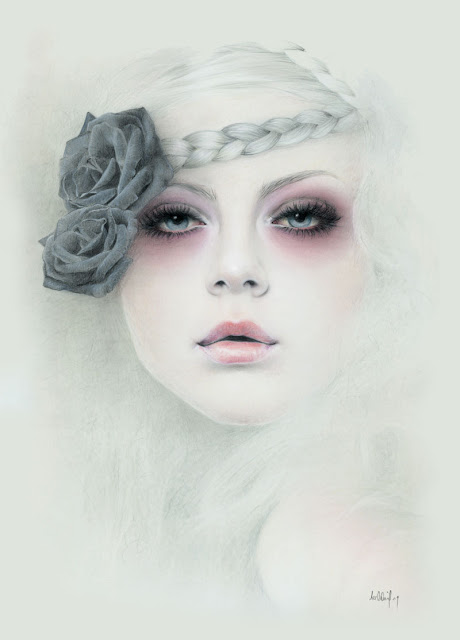
  The first set of colored pencils I had ever had was the Prismacolors Premier, Set of 132.

 In Singapore, where I live, it's really expensive to buy Art materials because we import everything. So, it cost me about $300 plus for this set. I thought it was worth it, because I had done my market research. Lots of Artists swore by the brand.

  One thing I really love about Prismacolor is that they have colors that other brands do not carry. "Limepeel", fo example, is an odd green color. But, I've grown to love it a lot because it looks like a natural green. Prismacolor also produces a good set of greys, seperated into warm greys and cool greys. Although if you wanted to darken a color, I'd suggest adding its complementary color and not grey. The greys would be, however, great for drawing white things.

  It wasn't all that bad. The pigments laid on well. The packaging was well done. There even was an instructional CD in the set which I truly enjoyed watching. However, as I started to do large paintings, I began to notice some quality problems in the pencils.

  My set contains an orange called, well, "Orange". PC 918 is its reference number. And at that point of time, right after my purchase, I decided to do an orange-red flower. Thus, "Orange" was an obvious choice. It's the brightest and purest orange in the set.

  Problem is, it didn't hold its point well. I thought, "Well, Prismacolors are wax-based pencils, so probably it's just how it is because that's how the pencils are made." However, when I tried sharpening that perticular pencil, its lead started to break. Not once, not twice, but thrice. It was horrible to see the lead go to waste. I stored the broken leads in a small box though.

  Later, I bought a electric sharpener. (I had been using a manual sharpener before that.) The breakage stopped. Thankfully. But the wood would chip sometimes.

  Many Artist have had the same problem and one of the reason we'd guess Prismacolors' quality would have dropped was that, now, Prismacolors produces its pencils in Mexico. You can see on the lowest pencil the words "MEXICO" stamped on it.


 It used to be made in the US of A. Perhaps, they had to cut costs? But seriously, we Artist treasure and love all of our materials because:
 1. They cost a lot of money to buy.
 2. We use them to create Art.
 3. They are how we express ourselves.

  So to have a company, whom have had a solid reputation for producing the best colored pencils in the market suddenlly have a quality drop is quite sad, really. All those years of building trust with Artists gone down the drain.

  If you'd like to see a discussion on the quality drop in Prismacolors, click here.

It seems like a recent thing, so if you have an older stock, good for you. If you're intending to buy a new stock, ask if they are made in Mexico or USA. If they are made in Mexico, I'd say not to buy, cause they are expensive and you do want to get what you paid for.

  Some Artists are giving their kids their current sets and are going to switch brands. Others are going to stick to Prismacolors and hope that the company would change back to the pencils made in the USA. Others have said that they would use up those pencils that they had before switching brands.

  I, for one, have my eye on the Polychromos set of 120 in a wooden box. But for now, I make do with what I have and the pencils don't break at all with my new electric sharpener. Although, they do chip once in a while.

  If you've reached this page trying to find where to get Prismacolors in Singapore, click here.

  What about you? Have you had any bad experiences with Prismacolor coloured pencils? Or are you the lucky few with an older stock? Which brands of colored pencils do you use and which do you prefer? Tell me in the comment section below.

Wednesday, 2 May 2012

Recommended Artist: Bec Winnel

The recommend Artist today is, Bec Winnel. She is a self-taught artist and studied graphic design. She turned into a full-time artist in 2012, and has been exhibiting in group shows for five years. She hopes to one day have her own sole exhibition.

Originally a country girl, she moved to Melbourne for five years. Her new home is now in the Alpine Valley region of Victoria, where she can focus completely on her Art and "be surrounded and inspired by nature and the simple things in life" as she says she is on her website.

  Her website is beautifully made and designed with her Art in mind. The site is very easy to navigate, so dropping by and looking around is made very simple.

 https://blogger.googleusercontent.com/img/b/R29vZ2xl/AVvXsEi27EjVLgW8jN9wuAH2jO_GRnTTKQKnfJS13ekDNnXxFhl6110HB498RYfFnRNUbv2YW5Fg2P4zclbeZi4K5RoEftOVxHgjYYn8HgeaVmpNoN2zIGtqlvIzp6nUYB_0Ex4WFQQ-ugGan9gA/s800/Farewell650.jpg

https://blogger.googleusercontent.com/img/b/R29vZ2xl/AVvXsEjJiaW6VNEyo6cpMuJHs3x8nCwS390skunH6BYtsD-FbRIZU8FpJhysNrJJm_elYPThRT4NUT9QfQhROBCs6Qu1v8Jcia093NDJaexy2tckMapIYaaHQeduJACYHFoEagtvrkeAFcafDoU/s1600/132_BecWinnel.jpg

http://becwinnel.com/wp-content/files_mf/1319606063Natalie_BecWinnel.jpg

Her favored medium is Pastel and Colored Pencils, but she's currently experimenting with Oils. Artists that push the boundaries of their comfort zones keep their Art fresh and their ideas new. What I like about her style is the dream-like effect that her works carry.

  In an interview with "Element Eden", Bec Winnel has said that the strongest influence she has had was from Sara Moon, and you can see how.

My take on her Art:
  She's inspired very much by the female form. Her paintings are soft and have a strong element of design. The colors she chooses for her paintings are well-made choices and work well together. She has a solid foundation in human anatomy and color theory which, in turn, aids her in making beautiful pieces of Art.

  Most of her Art is available in prints and some of the originals are up for sale, so do visit her shop to support a budding Artist.

  Again, visit her website at: http://becwinnel.com/

 What do you think about Bec Winnel's Art? Do you know of any contemporary Artists whom you think should be featured in the "Recommended Artist" segment? Leave your comments in the section below.