Thursday, 31 May 2012

Tulips On Cubic Background

 It's been almost a month since setting up this blog. I've discovered lots of brilliant Artists, whom were as kind to share their works as they were talented. Thus, I feel it's just the right time to show you one of my Art works. Keeping in mind that I am just 17 years old, as of 2012, here it is:

35cm by 25cm (14" by 10")
Done in Prismacolors
On Fabriano 50% Cotton Paper


  It's not the best day for photographing a painting as it is slightly under the weather now in Singapore. It's about halfway done. And if you were interested, here is the reference image. It is by "Chia" on WetCanvas.com's image reference library.


  I have not thought of a name for it yet, so, perhaps you might help me think of one? Leave me an idea of what I should name it in the comments section below.

  In other news, if you're on Tumblr, follow me at "http://everythingis-art.tumblr.com/". It's an Art inspiration blog, with pretty pictures, and lovely Art.

Wednesday, 30 May 2012

What to Put In Your Art Website

  You've searched the internet and have chosen a hosting website. You've been sitting on a chair for perhaps, an hour or so, and finally have come up with the perfect website name. Now then. What should you put into your website?

Your home page
  It's the first thing people see when they arrive on your site. It should have your name, what you are (an Artist), and perhaps two or three introductory lines. Also, some curators say to choose one Art work that you really like, and place it somewhere on that page.

Your Gallery
  "Works", "My Paintings", "My Art Works", you can title it lots of things, but make it clear and short, because that's what people are most interested in- your Art.

  If you have lots of paintings, you should split the them into a few series, or categories. Categories could go according to medium used, (Oil, Acrylic, Watercolor) or subjects, (Portraits, Landscapes, Still Life) or they could go according to series. (Bird Series, Blue Series, Abstract Series)

  Make sure that there are large enough thumbnails to show the Art works, so that viewers can decide whether they want to click on them. Also, it is a personal choice whether you want to show which Art works are sold, or otherwise. You could always have a separate gallery showing Art works that have been sold.

Artist Bio & Portfolio
  Your Biography is an introduction of you, your beliefs in Art, and where you see yourself heading. Stay away from politics, religions, and other unnecessary topics that are not related to your Art. (Unless of course, that is what your Art is about.)

  Your Portfolio should include what competitions, exhibitions (be they solo or group), awards, and other recognitions you've ever received/taken part in. You could, if you'd like, to include which Art school you graduated from, or what kind of formal training (if any) you've received. Most of the time, I am not interested in the school the Artist has graduated from, but if it adds to your Portfolio, then I say, go for it.

  A Portfolio can be written in a time-line form, or it could be written as an essay, whichever you feel suits your needs.

Contact Me/ Contact the Artist
  It should be on the navigation links and not hidden somewhere deep within your website.

  You must (yes, must.) include at least one contact detail. Be it, a phone number, an e-mail, or a gallery address. It'll be lovely if you could include all of them. I would say to NOT put private details, like where you live. However, Twitter/Facebook accounts are according to what you prefer. Also, whether you choose to place your blog in this tab, or in another tab altogether, is to your preference.

Design Layout
  Not something that you can put in your website, but it is something you need to consider. The navigation bar should ALWAYS remain in one place. The design should stay the same throughout the website. Colors should be complementary/neutral, which means no blood red, or bright yellow. Finally, never underestimate the legibility of Times New Roman font.

Other things that are worth a mention
  You should learn how to take good pictures of your Art works, in good lighting. Edit your images, and color correct them always, for they are representations of whom you are as an Artist.

  Make sure that your website can be viewed in Firefox, Internet Explorer, Google Chrome, and in Iphones and Android phones. Which means to make sure whether your website is phone compatible. It'll be a real waste if you've designed your website brilliantly, but have it to be incompatible with phone devices.


  And... That's it. These are all the things to consider for your website. Do you have an Art Website? Are there things I missed? Leave me a comment in the section below.

Tuesday, 29 May 2012

The Importance of a Personal Art Website

  There is a huge amount of importance on an Art website as it is your presence in the virtual world. When people open up Google, and type an Artist's name into the search engine, they are hoping that the first search result would be that of the Artist's blog or website. We, as humans, are restricted to being at one place at a time and so are our Art. However, in the virtual world, where everything is only 1s and 0s, there can be hundreds of visitors on your website at once, and you can give all of them the chance to view your Art.

  There is a number of hosting site to choose from. From Blogspot, to Blogger, to Webs.com. They each have the option given to you to pay a small sum of money to the them, and get a custom domain name. Each has their pros and cons, and lots of other website cover them, thus I will not go into those details.

  First thing to do, after you've chosen your hosting site, is to think of a name for your website. Even if, for now, you're not going to buy a custom domain name, do get a name that you'll like to keep, even in the future. When you get a custom domain name that differs from the name that you are using now, you'll loose traffic, and some people might not be able to find you.

  Your full name is the best name for your website. [www.yourname.com] If you're a female, and are worried to use your surname as you might change it after marriage, use your first and middle name instead. For example, I might use my first and middle name, Stephanie Jennifer, for this purpose. If your name is already taken, hyphens are helpful. [www.your-name.com] Do keep in mind though that too many hyphens are cumbersome to type, and to tell to others. Hyphens are not very helpful creatures.

  As you are thinking of a name, it will also pay to check whether the .com version of it is taken. If it isn't, it is a wise investment to register your domain name as soon as possible as many websites are taken very quickly. If it is, I recommend you think of another version of the name, or see if the .com(followed by whatever country you are in) For example, in my case, if "stephaniejennifer.com" is taken, I might try the Singapore version of it. "stephaniejennifer.com.sg"

  Lots of names are already taken, and as a website is a branding tool, you might get frustrated that your name is already taken. Never fear, though, other worthy "tricks" to try:
- Adding "artist" at the back of your name.
- If you paint/draw in mostly one medium, adding that medium of choice at the back.
- You might try to include where you live in your url. [youname-eastcoastart.com] for example.

  Also, if your name is easily misspelled, it may be worth to buy the variant of it. For example, if you choose your name as a website address, [CatherineJane.com], you might consider buying the variant [KatherineJane.com] and putting a redirecting message on that website.

  In my next post, (here) I'll be writing about what you might consider putting in your website.

Monday, 28 May 2012

Painting of the Day: Old New York

"Old New York (Rain)" by Ed Weiss

Watercolor and Indian Ink on 300 lb, 640gsm, Aches cold-pressed watercolor paper.
22" by 30" (56cm by 76cm)

  It's a beautiful piece, isn't it? I think that's due to the brilliant darks in the painting. His secret? He uses indian ink to lay down the darks.

  You can see the technical skill required to draw out the perspective, and the cars. The color scheme is wonderful, and I love the fading feeling of the buildings as they recede.

  Unfortunately, I could not find any information on the Artist, nor could I locate his website. If you do know any information on him, especially his website, do tell me in the comment section below as I would like to give credit to him.

Sunday, 27 May 2012

Painting of the Day: November Sunshine: Minnie

"November Sunshine: Minnie" by Kathy Caudill


Done in Transparent Watercolor. 10 1/2" by 15 1/2" (27cm by 39cm) Featured in "Splash 8"

Quote from the book:
  "...I discovered that I could enhance the soft look of my watercolor paintings by lightly scraping the dry paint with the edge of a double edged blade. The razor acts as an eraser to gently lighten or remove selected areas of paint. ...My old friend, Minnie, ... was diagnosed with cancer, (and) I wanted to paint ... the familiar softness of her fur, as well as the gentleness of her spirit."

  Brilliant work, as always from the "Splash" series. I love how the shadows connect the cat to the edges. The dark background does not detract you from the main subject, and the overall warmest of the painting is portrayed brilliantly.

Saturday, 26 May 2012

Recommended Artist: Nathan Fowkes

     Nathan Fowkes, one of the brilliant DreamWorks Artist that I found in "Moonshine". (If you'd like to find out more about the book, click here to see my review on it.) He has (is) also working for Blue Sky and animation big house, Disney.

  As his job scope requires him to work digitally, he uses his spare time to draw and paint in the traditional manner. He has originals on sale on his blog, and if you really like his style, he holds regular workshops too.

"Angeles Crest"- Watercolor on Paper

"Bridesmaid"- Charcoal on Paper

Photoshop Sketch

Environment study for "How to Train Your Dragon".

  As you can tell, he's awfully talented, and if you'd like to see more, visit his blog.

Friday, 25 May 2012

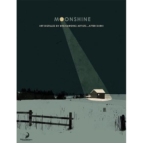
Book Review: Moonshine

  We've just had a lunar eclipse not too long ago, and it just happened that I chanced upon a book titled "Moonshine".

  It even has a blog on the project. Just click here.

The range of mediums and subjects covered within this book is wide, and so are the styles of the works. Now, I must say, I don't remember Artists by their names when I see their works unless I've read a book written by them. The reason being, is that when I go to an Art competition, I view the works, and not the Artist. Likewise, if I pick up a book with a range of Artists' works in it, my reason for choosing the book is to see a wide range of styles and mediums. Thus, I'm not too concerned with whom the Artist is. I'm more interested in the content of the paintings/drawings, the colors used within each Art piece, the composition, what I think the Artist could have improved on... etc.

  With books like these, I want inspiration, I want "wow", I want brilliant. Thus, I might not know each individual Artist within this book, but I love the Art within the book because they work for me. Some Art works might "work" for me more than others.

  The book itself has a good layout. With a range of different subjects, from characters, to landscapes, to design base pieces. Also, there is an Artist index at the back of the book that gives you the Artists' websites.

  Although, the price is slightly steep over at Amazon, and it might be a factor which you need to think about before purchasing the book. It's not a limited edition, nor was it hard-cover. Thus, unless you're an illustrator  or that you have an Artist within the book that you really like, I do say that you borrow it from the library instead of purchasing it,

  If you were wondering which Artists were within this book, this blog has a list on the Artists that are included in the book, plus a video on what is inside the book.

Thursday, 24 May 2012

Recommended Artist: Christopher Fisher

  Christopher Fisher does landscapes, portraits, and illustrations in, what I believe to be, oil. (If I am mistaken, please correct me.)


  If you would like to see which of his paintings that first made me sit up and watch him, click here.


  One of his illustrations that really left me in awe is a painting titled "Surgery In The Revolutionary War". Although, I must warn you that it is gory, and bloody. The painting will be shown right after the jump.

  It is also shown on his blog, whose address is right... here.


Painting of the Day: Battle of Fort Montgomery

"Battle of Fort Montgomery" by Christopher Fisher.


A link to his Recommended Artist page is right here.

Wednesday, 23 May 2012

Recommended Artist: Chichapie

  Chichapie is an artist hailing from the Philippines, and does his work in Digital Art. His paintings are usually fantasy paintings, but are executed quite well, ranging from fan art to commissioned pieces, and of course, personal ones too.

Self Portrait of the Artist.

Commissioned Piece

I, personally, adore this piece because the girl looks so bad-ass, and sassy. The colors are well executed and the simple traces of the background do not draw your attention away from the subjects.

And here, is where you'll find his DeviantArt gallery.